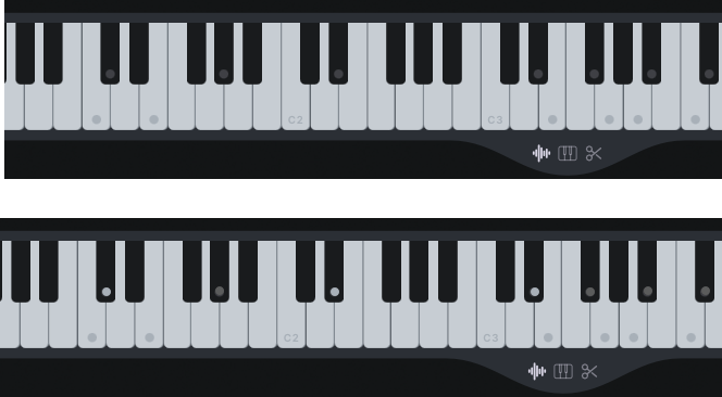
As per the title. It's currently hard to see them. Especially when the display is set at a lower brightness (for example, in the evening).
In the top image, the current color and the mockup below are two shades of lighter grey. The darker of the two would already be an improvement.